
Windows 11 is finally restoring taskbar flexibility with edge docking, smarter icon controls, and more personalized layouts. The update matters for power users, students, and developers who rely on speed and screen space. #windows11 #microsoft #taskbar #productivity #ux #windowsupdate
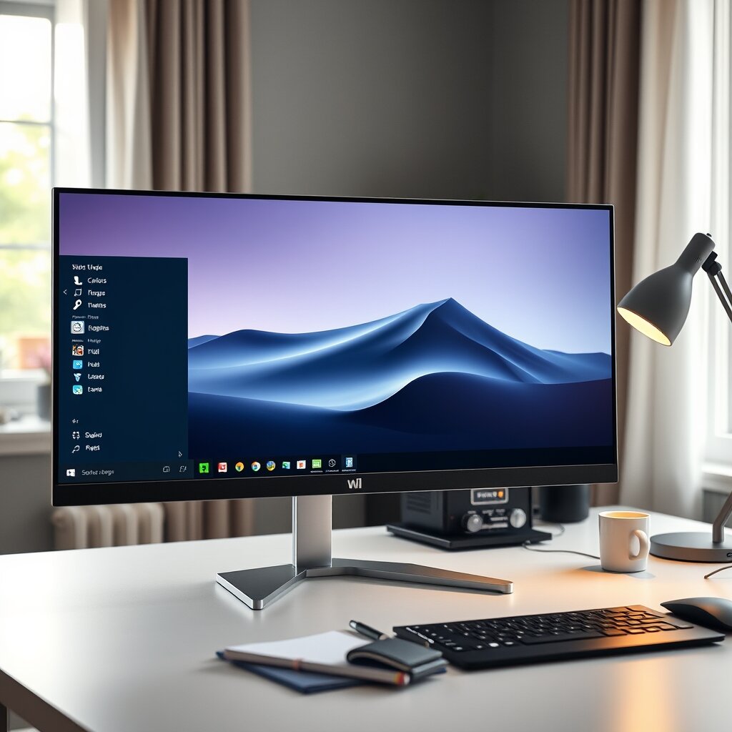
When Windows 11 first arrived, it made a strong visual impression. Rounded corners, softer transparency, and a cleaner overall interface helped the operating system feel more modern than Windows 10. But while the design was widely noticed, longtime users also spotted something else almost immediately: several familiar taskbar features had disappeared.
For casual users, those changes may have felt minor. For students juggling research tabs, developers running multiple tools, and office workers living inside productivity apps all day, they were anything but minor. The taskbar is not just a strip of icons at the bottom of the screen. It is one of the most-used navigation tools in Windows, and small changes to its behavior can have an outsized effect on daily workflow.
Now, Microsoft appears to be addressing one of the most persistent complaints. A new Windows Insider Preview build brings back the ability to dock the Windows 11 taskbar to different edges of the screen, including the left and right sides. It also introduces more granular behavior depending on where the taskbar is placed, giving users more control over alignment, labels, and icon grouping.
That may sound like a modest update, but for many users it represents something bigger: Windows 11 is continuing to mature into a platform that looks modern without forcing everyone into the same workflow.
Why This Windows 11 Update Stands Out
Microsoft has added many improvements to Windows 11 since launch, but this taskbar change stands out because it addresses a feature gap that users have discussed for years. The original Windows 11 redesign simplified the taskbar in ways that made it visually cleaner, but also less flexible than the version in Windows 10.
Being able to move the taskbar to another side of the display used to be a normal part of Windows customization. Many users placed it vertically on the left or right to save horizontal space, especially on widescreen monitors. Others preferred different layouts for different screens in a multi-monitor setup. That freedom disappeared in Windows 11, and the absence felt especially noticeable because it had existed for so long in previous versions.
The new Insider build changes that equation. With support for docking the taskbar on any screen edge, Windows 11 is beginning to restore an important part of desktop personalization rather than treating customization as an afterthought.
What Users Can Customize
According to early details from the preview build, Windows 11 is not simply restoring the old taskbar behavior in a basic form. Microsoft is also allowing users to apply slightly different settings depending on taskbar placement. That makes the change more practical than a simple on-or-off return of legacy behavior.
- Dock the taskbar to different screen edges: bottom, top, left, or right.
- Set different alignment preferences: useful for people who want centered icons in one position and left alignment in another.
- Adjust labels and icon grouping: especially helpful for people who rely on multiple instances of the same app.
- Preserve separate preferences by position: Windows can remember how you want the taskbar to behave depending on where it is docked.
That last point is particularly interesting. It suggests Microsoft is thinking beyond nostalgia and toward context-aware flexibility. A vertical taskbar may work best with one set of icon behaviors, while a bottom taskbar may suit another. Letting the system remember those preferences makes the feature more useful in real workflows.
Why Missing Taskbar Options Frustrated So Many Users
It is easy to underestimate how much people depend on the taskbar until familiar behavior changes. On paper, taskbar placement looks like a small preference. In practice, it affects how people scan information, switch applications, and use available screen space.
Take a student writing a dissertation or preparing class notes on a laptop connected to an external display. A vertical taskbar can free up more room for browser tabs, side-by-side documents, and PDF viewers. For a developer working in an IDE, terminal, browser, and documentation window at the same time, a taskbar on the left can be more efficient than one stretched across the bottom.
These habits are not rare edge cases. They are part of the way many people have shaped Windows around their own needs over years of use. When Windows 11 removed some of that flexibility, users were not just reacting to preference; they were responding to a disruption in muscle memory and productivity.
That is one reason this update matters. It acknowledges that desktop operating systems are tools first. A polished interface can make software more inviting, but if it limits the ways people work, the shine wears off quickly.
The Bigger Story Behind Windows 11’s Design
Windows 11 launched with a clear design philosophy: simplify, modernize, and reduce visual clutter. In some areas, that strategy worked well. The settings app became more coherent, window layouts improved through Snap features, and the overall presentation felt more consistent than earlier Windows releases.
But taskbar and Start menu changes revealed the trade-offs of redesigning a long-established platform. Simplification sometimes meant removing options rather than rethinking them. Features that had been deeply woven into how people worked were either missing or less capable than before.
This is a classic challenge in platform design. New users often benefit from cleaner defaults, while experienced users expect the flexibility they have built workflows around. Balancing those audiences is difficult, especially for a product used by students, gamers, developers, enterprise teams, and creative professionals all at once.
Microsoft has spent the years since launch gradually closing that gap. Some missing features returned quickly. Others took longer, likely because the taskbar was not just visually refreshed but rebuilt in ways that changed how those options could be implemented. The latest preview suggests that the company is willing to keep refining Windows 11 rather than treating its launch design as untouchable.
Why Edge Docking Matters More Than It Sounds
For many users, putting the taskbar on the left or right side of the screen is not about aesthetics. It is about ergonomics and efficiency.
Modern displays are usually wider than they are tall. That means vertical space is often the more valuable dimension. A taskbar running along the bottom takes away height that could otherwise be used for reading, coding, editing, or browsing. A vertical taskbar can preserve more room for document pages, long websites, and code files.
This becomes even more relevant on:
- Ultrawide monitors where horizontal space is abundant
- Portrait displays used for coding, writing, or reviewing documents
- Multi-monitor setups where different screens serve different purposes
- Touch and hybrid devices where reach and layout preferences vary
There is also the issue of visibility. Some users find vertical taskbars faster to navigate because app names and icons can be easier to distinguish in a stacked format, especially when many windows are open. Others prefer bottom placement because it aligns with decades of Windows habit. The point is not that one position is universally better. The point is that Windows works best when it allows the user to decide.
What This Means for Developers, Students, and Power Users
Developers and technical users often notice interface regressions before everyone else because they spend so much time inside operating system tools. A taskbar is not a secondary feature when you are constantly switching between terminals, browsers, local servers, chat tools, file explorers, virtual machines, and documentation.
For anyone learning modern software workflows, this update is also a useful reminder that user experience is not only about how something looks. It is about how well software supports real tasks over time. That lesson matters whether you are studying computer science, designing products, or building web applications.
Students exploring practical software skills can often see that connection more clearly through project work and internships. For example, a full stack development internship exposes learners to how front-end usability, back-end logic, and product decisions meet in real-world tools. Similarly, a cloud computing and DevOps internship can help learners understand why operating system efficiency and interface consistency matter in professional environments where reliability and workflow speed are critical.
Even if you are not writing desktop software, Windows changes like this show how strongly product adoption depends on listening to practical user feedback. The most elegant redesign can still create friction if it ignores established behavior that people depend on every day.
Windows Insider Preview: What the Rollout Tells Us
Because this feature is appearing in a Windows Insider Preview build, it is still in the testing phase. That matters for two reasons.
First, preview features can change before broad release. Microsoft uses Insider channels to evaluate performance, compatibility, and user response before rolling updates out widely. If you want to follow that process, the official Windows Insider Program is the best source for release details and testing information.
Second, the staged rollout reflects how careful operating system vendors need to be when restoring deep system features. A taskbar that can dock to different edges has to work properly with animations, scaling, multi-monitor behavior, snapping, notification panels, and accessibility settings. Something that sounds simple on the surface may require significant engineering under the hood.
Users who want to keep track of the broader evolution of the platform can also review Microsoft’s official Windows 11 overview, which highlights current features and design direction.
The Engineering Challenge of Bringing Old Features Back
One of the more interesting aspects of this story is that


 Your IP Address : 216.73.217.30